Welcome to the third installment of “Fine Art Explained”. This is a very irregular series of posts, in fact I do one when I feel I have to tell you something interesting and at least fairly original. I hope this is the case today, as I cover two techniques that I have used on quite some images recently, but not yet demonstrated. This is a Photoshop tutorial, thus if you don’t use Photoshop, you may probably lose interest about here 🙂
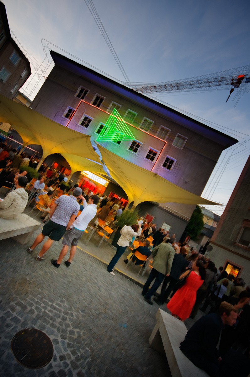
Today’s image has been shot on Tuesday evening in Salzburg. I was there for “Irmingard”, an opera (well, more of a parody) by the Austrian Brass group Mnozil Brass. Suffice to say it was excellent and very funny 🙂
The show took place at the Republic, a club in central Salzburg, a former cinema with a big hall in the back. I knew the Republic from some years ago, but neither had I known about its past, nor could I remember exactly how it looked like. I had a vague idea though. I knew that I would not have much chance for photographing that day, thus I decided to try a wide-angle shot of the entrance area and, this being what came out of the camera originally, it turned out just like I had expected. It was already evening, the sky was still blue, lights were on inside and there were tons of people. The crane was a nice addition.
Right out of the camera the image was unusable. The sky was still very bright, everything else much too dark, and that being a wide angle image, I would have needed a truckload of strobes to light it properly. I decided to rely on my D300’s latitude instead.
What I imagined was much more color, especially more color variation, something that would really pop, and along with that a comic-like look, something vibrating. The camera had been on automatic white balance. At least in the sky the color was not altogether wrong, but everything else had a bad bluish cast. In such cases I normally combine two versions from the same RAW, with different color balances and probably exposures. The first one was very similar to what came out of the camera.
 The second was much warmer. I can’t remember by how much, but I guess at least 2000K, and I developed it much lighter as well.
 I then layered the two and used a mask to keep the sky and the area near the edges cool. On top I put a layer “clean”, where I cloned out a piece of roof that stood in from the right edge. In general it is a good idea to put such a cleanup layer atop of all pixel bearing layers. Otherwise you would have to clone on all of them.
 So far we have still a flat and dull image, but there is already much more color variation. Now let’s push color.
What do you do when you want to increase saturation? Well, chances are, that you do like I did until maybe a month ago, you use a “Hue / Saturation” layer and increase saturation. Here I have done something different, something that is much more akin to the effect that you get from the new “Vibrance” slider in Camera Raw.
I read about this in one of the two photography magazines that I still buy more or less regularly, Photographie and DOCMA, the latter being a very Photoshop centric magazine about digital image processing, and actually by far the best that I know of. It’s German only though.
I did use a “Hue / Saturation” layer here, but I used it in “Soft Light” blending mode. Try that on an image, and really, saturation goes up even with the saturation slider on zero, but so does contrast. That’s simply what “Soft Light” does, and so far you could have used an unmodified curves layer as well. Now, to mostly cancel the contrast changes, increase the lower slider labeled “Lightness”. What I used was “Lightness +30”, “Saturation +40”, and because I didn’t like what this did to the highlights, I went into the blending options, split the white “Blend If” slider (by holding “Alt”) and dragged it all the way to the left. Basically this fully blends in the “Soft Light” layer in the shadows and not at all in the extreme white. The result is some lightening and an increase of saturation in the mid-tones. You see this best in the reds.
When you’ve done that on an image, check also what this does to your histogram. If it was intact before, it should still be intact, but a little bit pushed to the right. Why do I do this? Well, as I said, you could do something similar while already in the RAW converter, but doing it this way gives you much more control and flexibility. There is a case for opening the RAW file as a smart object, and while this gives similar flexibility, you have one drawback: changes in the smart object interfere with cloning. The next two layers simply apply darkening curves. Both are masked, in order to restrict the darkening to certain parts of the image. The first is kind of a vignetting, …
 … the second darkens everything but the people. Combined, they give depth and contrast, and they keep the eye where the action is. Now this already begins to sing.
 To get still more vibrance to the people area, we add another “Hue / Saturation” layer in “Soft Light” mode, “Saturation +20”, “Lightness +50” this time, but now without messing with the “Blend If” sli
ders.
To get still more vibrance to the people area, we add another “Hue / Saturation” layer in “Soft Light” mode, “Saturation +20”, “Lightness +50” this time, but now without messing with the “Blend If” sli
ders.
You may have seen the next effect that I have used in “629 - Electric Ladyland V” for the first time, and then in variations a couple of times since. First we need a merged copy of the layers so far. Use “Select All” and “Edit / Copy Merged”. Use “Edit / Paste” to make the result a new layer atop. On that layer apply “Filter / Stylize / Find Edges” and desaturate the result. Now you have a white layer with black edges. I frequently multiply such a layer, and this works extremely well in very noisy images (see “448 - Down In The Hole” for a tutorial about that and “458 - The Long And Winding Road” for another example), but here I wanted those edges distorted in multiple ways. I duplicated this layer twice, and then I began to distort each of the three layers differently. One way to do that would be “Filter / Liquify …” with a big brush, and sometimes I do that as well, but normally I do the base job with “Edit / Free Transform” and by simply tugging from the corners, trying to keep the center mostly in place. Here the important point to keep intact is where the crane and the cable join with the roof. Finally I have put each of the three layers in “Multiply” mode, grouped them together and reduced the opacity of the group to 60%.
 Please note that you may get a serious problem with your lights now. And really, some of the hardest edges are those around the lights on the building. Now that we have distorted the edge layers, those are even mis-aligned, and the result is, that the lights are hidden by a mess of dark lines. To salvage that, we simply apply a mask to the group of edge layers and hide the edges where we want the lights to shine. In this case I have also hidden the lines on the two main characters left of the center, this way setting another accent.
 I could have left it at that, but decided to go for a more painterly look. For that I needed another copy/merged layer, but without the edges. I temporarily made the edge group invisible, did “Select All” and “Edit / Copy Merged” again, but instead of pasting into this image, I created a new image, pasted there and changed the result to 8 bit. I did that, because in the 16 bit mode that I normally use, I don’t have access to all “artistic” filters. I applied quite rough “Angled Strokes” and copied the result back atop the edge group. Here you see a 100% crop from that layer at 100% opacity. Then I dialled this layers opacity back to 60%.
 Did I get any artifacts by going through this 8 bit intermezzo? Not really. First it could be said that the whole layer is an artifact and, more important, there is nothing wrong with 8 bit layers per se. After all, the final image will be an 8 bit JPEG as well. It is only that applying steep curves and other extreme manipulations to 8 bit images is dangerous and prone to produce banding. No problem here, and even less so, because by reducing opacity I have re-introduced the nuances from below.
 At this stage I thought I was done and applied a sharpening layer (another copy/merged layer with luminance sharpened in Lab color more and an edge mask applied), but afterwards I found that I wanted even more color and light in the entrance area and on the people, thus I added another “Hue / Saturation” layer in “Soft Light” mode, and that is it.
There is no Song of the Day today, but I leave you with a trailer to Mnozil Brass’ 2006 operetta “Das Trojanische Boot” (“The Trojan Boat”). It starts weird but … well, it’s Mnozil Brass after all 🙂