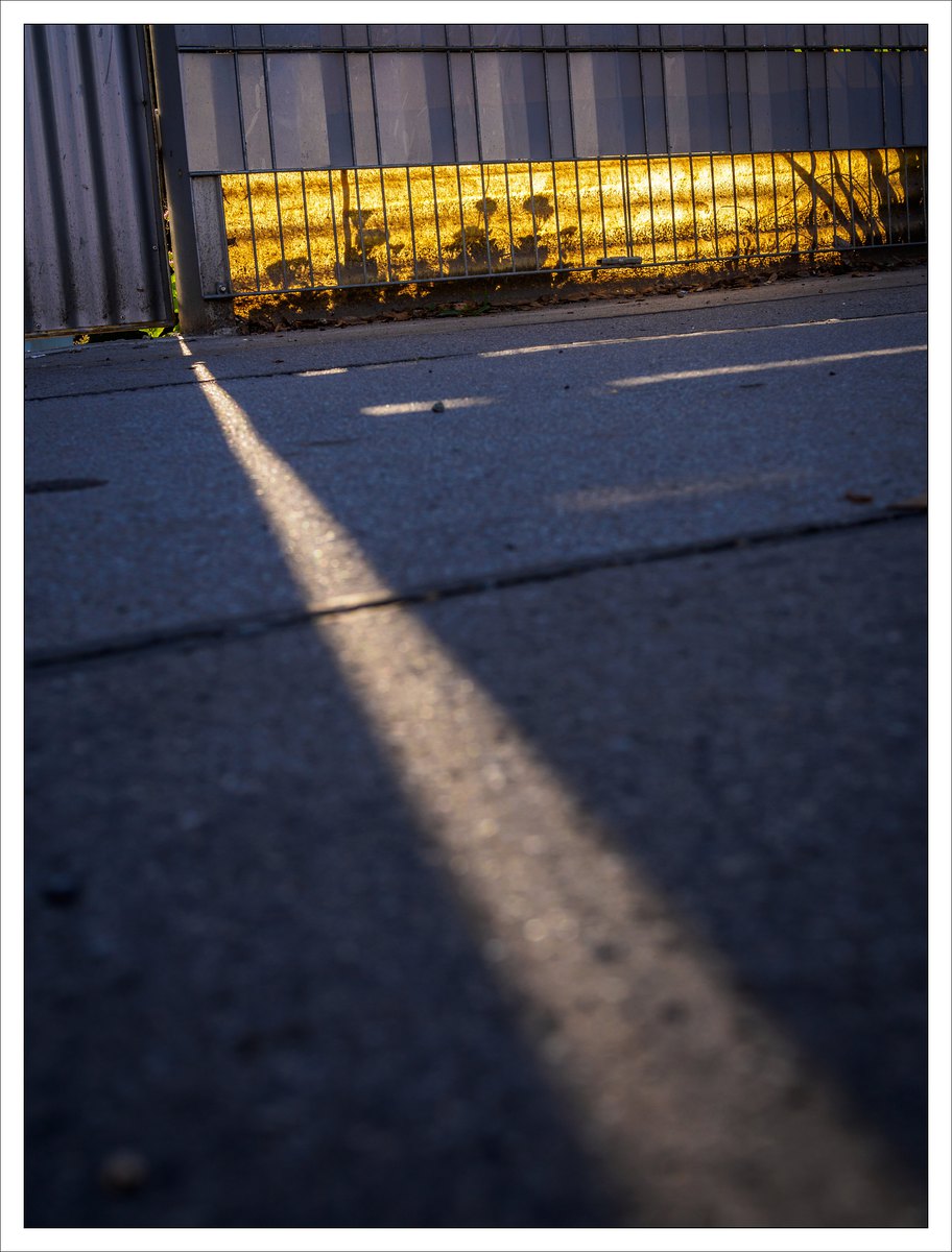
What’s the proper color temperature for such an image?
Some people use gray cards and it makes sense for them. For me it does not. I go for a balance between warm and cool, normally trying to get shadows more on the blue side.
Canonically correct for this image would have been warmer and less magenta, but what I really was after, that was the gold behind the fence. Warmer would have done nothing for the gold, and taking magenta out would have resulted not in gold but in plain yellow.
Sometimes realism is not my first priority.